This is the first of what might become a series of essays on user interface design in video games. If you enjoyed the article and would like to see more, please let me know!
1. Introduction to Bad Design
If you've been around the online Destiny community long enough, you've surely seen your fair share of posts like this:

(If you're not familiar with Destiny, think of this as accidentally throwing away a check for a thousand dollars.)
I see two common responses to this: either "yeah you're an idiot, way to go," or "yeah the interface sucks." The second is more accurate than the first; good user interfaces should prevent catastrophic, irreversible errors from happening. This interaction is a failure of Destiny 2's interface design.
Before I go on, I should say that I think Destiny 2's interface is actually pretty good in general. Aesthetically it looks pleasing, and it has a strong design language that the game applies consistently to efficiently convey information (I'll go into that in more detail in another essay).
When a user says that an interface "sucks," what they're really saying is that the interface failed to account for the way they think. No designer can anticipate the thought process of every possible user, which is why the best interfaces are products of iteration, battle-hardened through real-life interaction. Nobody designs a bad interface on purpose (well, almost nobody, at least). We remember only the negative moments, because positive interaction with software is invisible. Interfaces are tools to interact with a system, and the less we have to think about the tool we're using to carry out a task, the more we focus on the task itself and ignore everything surrounding it.
In a very long (and very interesting!) three part article released in August 2019, Destiny's game director Luke Smith responded to the criticism of the then-recently reworked Pursuits interface, saying:
[The UI team was] crestfallen. Not just because of the sometimes-harsh-feeling feedback, but because this team wanted make something sweet, exceed your expectations, and meet their own expectations. None of those things happened. We wanted to try something different with Pursuits, in the sense that we knew where we wanted this feature to end up, but that we'd take some iterative steps to get there.
It's important to provide feedback; it's the only way an interface can improve. It's immediately clear when an interface fails; you feel like you're fighting against the machine, and it's frustrating. This is why most user feedback comes in the form of "this sucks," which, yeah, fair. It does suck. Thank you for letting us know! (But, y'know, be nice about please. Designers are people too.)
That being said, I'm not familiar with the Destiny codebase. Something that seems easy to fix from the outside might actually be a nightmare - I'm reminded of a time my project manager asked me how easy it would take to build a a specific interface horizontally (ten minutes) versus building it vertically (impossible). Different frameworks handle some things well but others horribly, and a critical part of software development is properly considering those constraints. For that reason, I try not to make any hard judgments in this article about how "easy" it is to make a software change. I'm a user of Destiny 2, not a developer, and while users are really good at discovering problems, they are really bad at knowing how to fix them.
2. Core Problems
When you accidentally delete your entire stack of masterwork cores because you weren't paying enough attention, we call that a slip: intending to carry out one action, but instead doing another. The user had the right goal in mind, but their execution was flawed. Contrast this against an mistake, where the user misunderstood the context in some way.
Generally speaking, a slip is a failure of attention, while an mistake is a failure of understanding. If I'm trying to read insightful articles on user interfaces in games and type twitter.com/Corvimae, that's a mistake; I'm misinformed as to where to find the article, and no matter how accurately I carried out the task I wouldn't find what I'm looking for. If I type myabreak.com into my browser, the browser will return an error. That's a slip; my method was correct (May writes good articles and is so humble about it!), I just made a typo. The browser helpfully informs me that something's wrong, I correct the mistake, and move on.
Errors aren't 100% preventable. People screw up. They get distracted, their brain goes on auto-pilot, or they forget a vital piece of information, and suddenly an error occurs. Good interface design aims to make it harder to commit errors, and to make the consequences less painful.
The masterwork core problem is a mistake caused by what I think is the biggest failure of Destiny's user interface: the F key.
(A note for the more console-inclined: I play on PC, so this article references PC controls. Substitute whatever button your version of the game uses, because honestly I have no idea.)
The most common interaction you have in Destiny's menus is dismantling - an action carried out by holding down the F key. Destiny is constantly giving you useless loot that you'll never use, and dismantling it gives materials that you might use someday. It creates a gameplay loop of do an activity, dismantle bad gear. It's such a frequent interaction that it becomes nearly invisible; I've deleted some decent gear because I wasn't thinking and just assumed it would be bad. In Destiny, you click on aliens, and you hold down F.
Whether you wanted it or not, play enough Destiny and you associate F key becomes associated with dismantling; you internalize the rule "press F to dismantle". If consistently applied across the application, this is great! You wouldn't hit the F key unless you intended to dismantle something, making the error a slip: "I hovered over the wrong thing because I wasn't paying attention." That's not 100% preventable from a design perspective; the best you can do is either prevent the action entirely, or give the user enough time to recognize they're making a mistake before it happens - something Destiny actually does implement for rarer gear. Rarer gear requires you to hold down the F for longer before the dismantle action is carried out, so you really have to commit to delete the rarest, Exotic gear.
(That said, exotic gear isn't random and can be retrieved at-will after deletion, so it actually needs less protection than the less rare Legendary gear - unless it's Year 3 armor, which has random stats. It's an detail that comes from a hard rule that makes sense - the more rare the piece of gear, the harder it is to break - but isn't always ideal in practice. Spoiler: this is a recurring theme.)
Except, Destiny actually has two rules for F: "press F to dismantle" and "press F to use." This provides an opportunity to commit an action-based slip: the right action was performed on the wrong object.
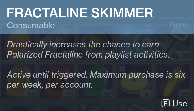
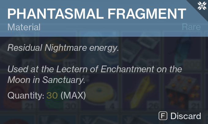
Those two items are in my Warlock's inventory as I write this, and they are right next to each other. When you hold down F long enough for the action to occur, it is applied to the item under your cursor. Move your mouse a hundred pixels the wrong way, boom, no more Phantasmal Fragments. You carried out all the proper steps to use a Fractaline Skimmer, you just bumped your mouse.
This issue was never made more obvious than with a bug introduced with the start of the Season of Dawn. Resonate Stems, an item introduced with the Warmind expansion (and which I think are pretty fun - until you realise they're not duplicate protected, a problem I could honestly write a whole second essay about).
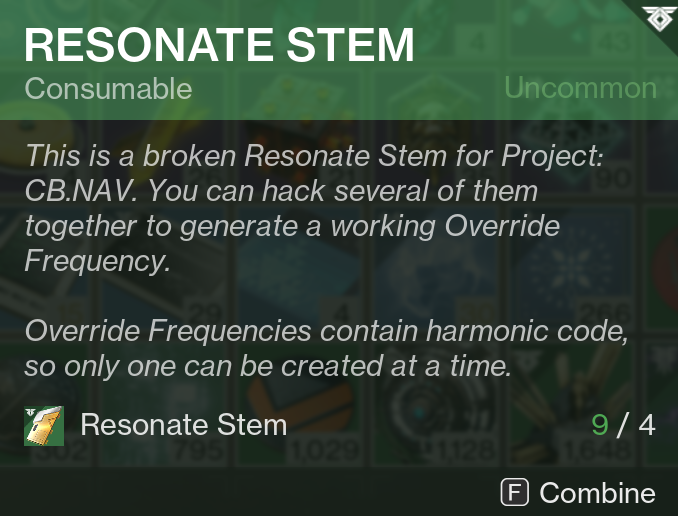
Resonate Stems use the "press F to use" rule; it says Combine, but it's a Use action, trust me. When the Season of Dawn patch was launched, the "press F to dismantle" rule got incorrectly applied to Resonate Stems - despite the prompt still saying Combine.
My point is, I wasted eight of these stupid things and I want them back. But also, it's a problem that shouldn't exist. There are seven possible interactions in the items menu: next sub-inventory, previous sub-inventory, view settings, view character, discard/use, view details. I feel pretty confident in saying that the Dualshock 4 and the Xbox One controller each have at least that many buttons plus one. Change the rule of "F to use" to "click to use." I'm suggesting click because that's a rule that literally exists.
Between all of Destiny's menus, I only found three different key prompts across every menu in the entire game: left click, right click, and F. There's a pattern to these actions that lead me to the conclusion that Destiny's inventory framework only supports three contextual actions: one destructive (consuming or destroying an item), one that leads to a sub-menu, and one that equips a piece of gear. On PC, left click is the non-destructive equip, F is the the destructive "use or destroy", and right click is view details. So far, I haven't found any counterexamples for this (but if you find one, let me know!).
3. Paying Your Debts
If you're still here, first, thanks for sticking with me, and second, you're probably thinking:
"Wow, May, this sure was a lot of words to describe something that's super obvious."
And, okay, yeah. True.
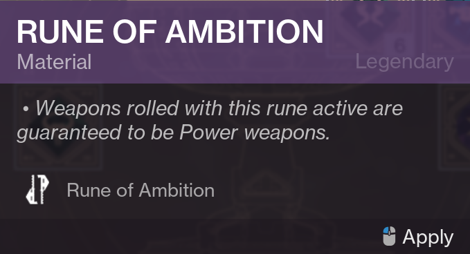
But the obviousness of this issue is what makes me think fixing it is non-trivial. Because it's so obvious, right? Just reuse the "left click to apply" for Use actions; apply and use are literally synonyms, after all!
When I first wrote this article, I hadn't yet recognized the destructive/non-destructive distinction, and I made a joke about how Apply and Use are the same. But in the language of Destiny's, they're different; Equip is a synonym for "Apply to gear slot", and Use is a synonym for "Destroy one (with a side-effect)." There's a logic to this, but that logic is non-obvious and took me writing this article to recognize - something I didn't realise through over a thousand hours of gameplay.
The fact that the "intend to use but accidentally delete" slip is so common makes it a failure of design, but I'm positive it's really hard to fix in the Destiny engine, because otherwise they would've done it already. If I'm correct and Use is just an "on destroy" hook on certain items, it could require refactoring large swaths of menu code, and refactors always come with the risk of quality regressions. I think it's worth changing, but I'll always lean to the side of improving interfaces regardless of the risks - and that's why I'm a UX engineer and not a project manager.
With the release of Shadowkeep, Bungie changed the masterwork core destroy interaction so that it only destroyed one core, not the whole stack. I'm not sure why they didn't make it impossible to delete the stack entirely, since that is something we know is possible, and there's no reason I can think of that you'd want to ever destroy one. It's a workaround that doesn't address this problem, but it does drastically reduce the impact of a different slip: just straight up dismantling the wrong item entirely.
Which is good, because that means Part 2 can be about something else.